Real-Time Charting of Electrical Sensor Data
April 20th, 2014 by ryan
Let’s look at how we can display real-time and historical sensor data for Household Electrical usage using sqlDashboards.
The historical data is taken from the UCI Machine Learning Repository. This is a single CSV file with 1 minute readings between December 2006 and November 2010. i.e.
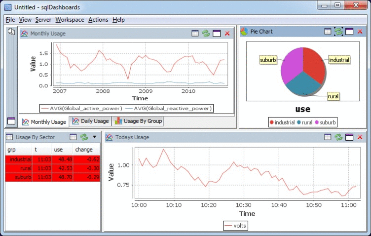
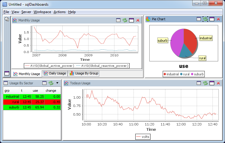
The Sensor Data Sql Dashboard
Time Series Data Format
The data came in the following format:
| date | time | Global_active_power | Global_reactive_power |
|---|---|---|---|
| 2006-12-16 | 17:24:00 | 4.216 | 0.418 |
| 2006-12-16 | 17:25:00 | 5.36 | 0.436 |
| 2006-12-16 | 17:26:00 | 5.374 | 0.498 |
Where the columns have the following meaning:
- date: Date in format dd/mm/yyyy
- time: time in format hh:mm:ss
- global_active_power: household global minute-averaged active power (in kilowatt)
- global_reactive_power: household global minute-averaged reactive power (in kilowatt)
- voltage: minute-averaged voltage (in volt)
- global_intensity: household global minute-averaged current intensity (in ampere)
- sub_metering_1: energy sub-metering No. 1 (in watt-hour of active energy). It corresponds to the kitchen, containing mainly a dishwasher, an oven and a microwave (hot plates are not electric but gas powered).
- sub_metering_2: energy sub-metering No. 2 (in watt-hour of active energy). It corresponds to the laundry room, containing a washing-machine, a tumble-drier, a refrigerator and a light.
- sub_metering_3: energy sub-metering No. 3 (in watt-hour of active energy). It corresponds to an electric water-heater and an air-conditioner.
Creating the SQL Dashboard Charts
To create the live charts I:
- Imported the data to MySQL database.
- Created a java process to insert live sensor data.
- Opened sqlDashboards
- Added a time series monthly graph and using the sql query:
select STR_TO_DATE(DATE_FORMAT(Date, '%Y-%m-01'),'%Y-%m'),AVG(Global_active_power),AVG(Global_reactive_power) FROM power GROUP BY DATE_FORMAT(Date, '%Y-%m-01') - Added a daily time series rollup graph and using the sql query:
CREATE TABLE daily AS select Date,AVG(Global_active_power),AVG(Global_reactive_power) FROM power WHERE Date>'2009-11-11' GROUP BY Date; - Added a bar chart showing the different meter readings as bar charts per year:
select CAST(YEAR(Date) AS CHAR(4)) AS Year,AVG(Sub_metering_1),AVG(Sub_metering_2),AVG(Sub_metering_3) from power GROUP BY YEAR(Date) - Added further queries to show the live data for today…
[raw]
[/raw]
This gave me the final dashboard:
[raw]
[/raw]