sqlDashboards Example Charts Dark Theme
For each of the chart types their data format expected together with some examples are shown below
Time Series
Format
- The first date/time column found will be used for the x-axis.
- Each numerical column represents one time series line on the chart.
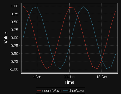
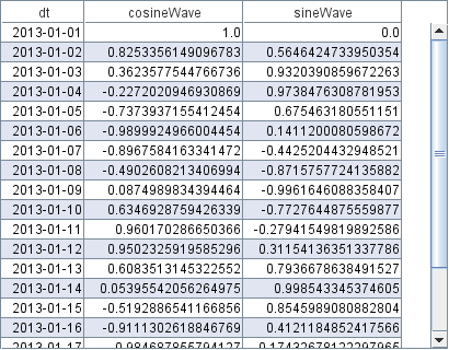
Day Sines
A sine/cosine wave over a period of days.
KDB Code
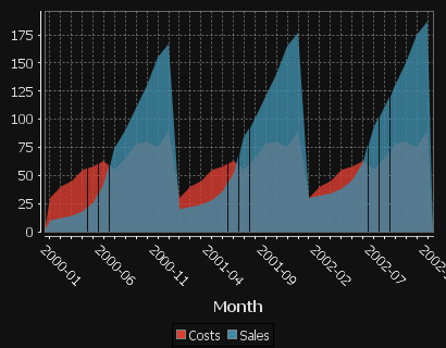
Area Chart
Format
- The first string columns are used as category labels.
- Whatever numeric columns appear after the strings represents a separate series in the chart.
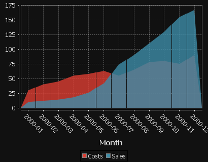
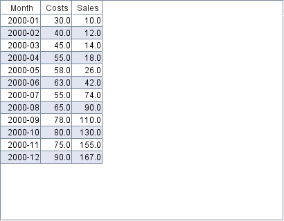
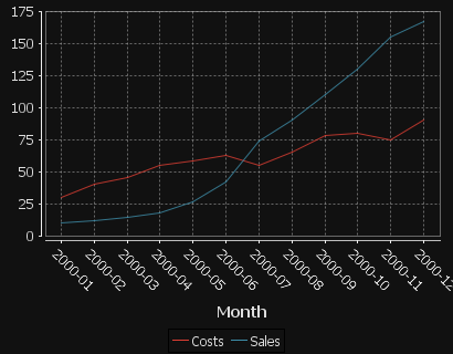
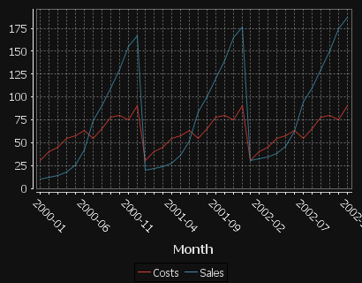
Multiple Series with Time X-Axis
2 series are shown, one for Sales, One for Costs. x-axis is in months.
KDB Code
Single Category
One number column generates one series.

KDB Code
Multiple series
Each column is a new series/colored bar.

KDB Code
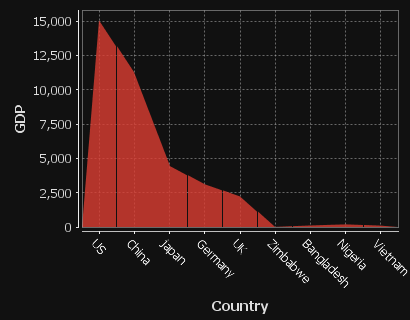
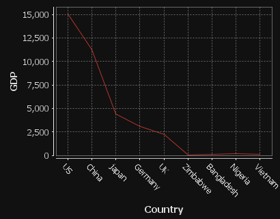
Multiple series with many categories on the X-axis
Each column is a new series/colored bar. When there are a lot of categories, some labels are hidden.
KDB Code
Bar Chart
Format
- The first string columns are used as category labels.
- Whatever numeric columns appear after the strings represents a separate series in the chart.
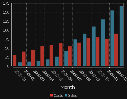
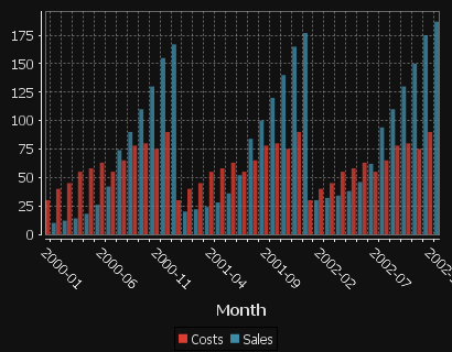
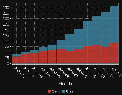
Multiple Series with Time X-Axis
2 series are shown, one for Sales, One for Costs. x-axis is in months.
KDB Code
Single Category
One number column generates one series.
KDB Code
Multiple series
Each column is a new series/colored bar.
KDB Code
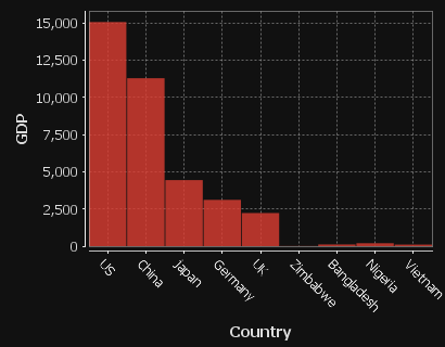
Multiple series with many categories on the X-axis
Each column is a new series/colored bar. When there are a lot of categories, some labels are hidden.
KDB Code
Bar Chart Stacked
Format
- The first string columns are used as category labels.
- Whatever numeric columns appear after the strings represents a separate series in the chart.
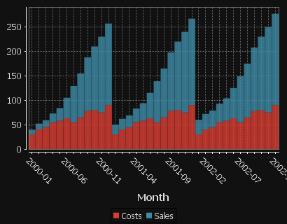
Multiple Series with Time X-Axis
2 series are shown, one for Sales, One for Costs. x-axis is in months.
KDB Code
Single Category
One number column generates one series.

KDB Code
Multiple series
Each column is a new series/colored bar.
KDB Code
Multiple series with many categories on the X-axis
Each column is a new series/colored bar. When there are a lot of categories, some labels are hidden.
KDB Code
Bubble Chart
Format
- The first string columns are used as category labels.
- There must then be 3 numeric columns which are used for x-coord, y-coord, size in that order.
Single series
The three columns are used for x-axis,y-axis and size respectively. Notice the GdpPerCapita column has been divided to make it similar sized to the othercolumns so that the bubbles are a sensible size.
KDB Code
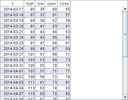
Candlestick
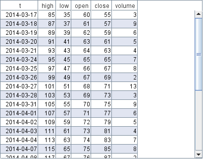
Format
- The table should contain columns labelled open/high/low/close/volume
but must atleast contain high/low to allow it to be drawn.
Only weekday values are shown.
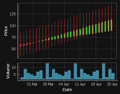
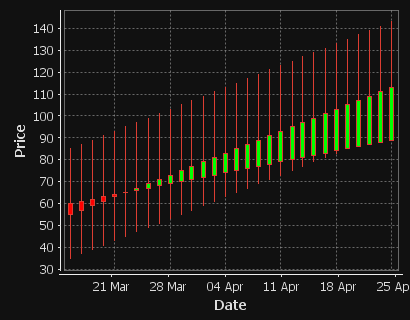
Prices going up
A Candlestick showing price movements and fluctuating volume over a period of 6 weeks
KDB Code
Rising Prices, No Volume
A candlestick showing only price movements, no volume column.
KDB Code
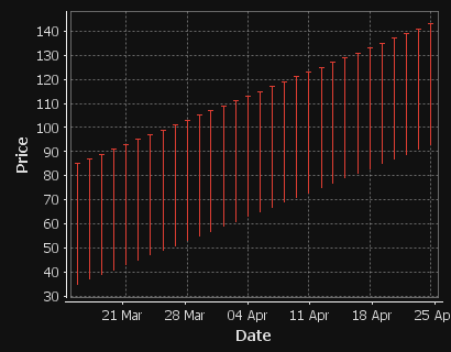
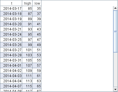
Rising Prices, Only High Low Columns Shown
A candlestick showing only high low prices.
KDB Code
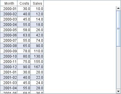
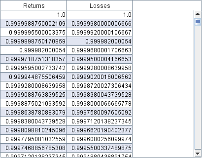
Data Table
Format
Any format of table is acceptable, all rows/columns will be shown as a plain table.
Many Columned Table
All rows/columns will be shown as a plain table.
KDB Code
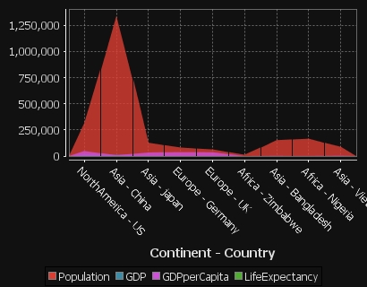
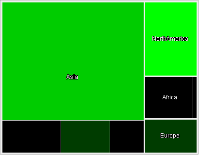
Heat Map
Format
A HeatMap works best with 1+ string columns.
- Starting from the left each string column is taken as one nesting level
- The first numerical column will be taken as size, the second as colour.
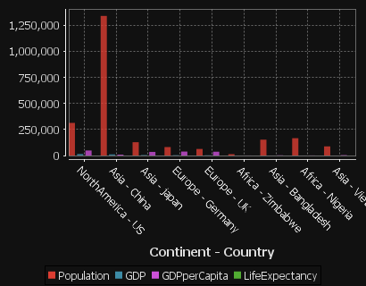
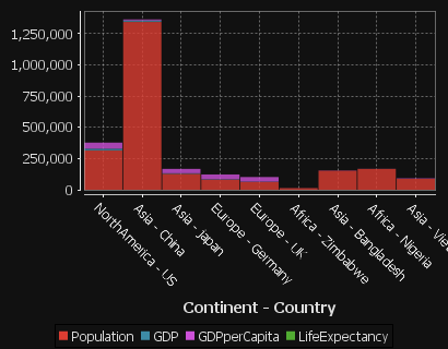
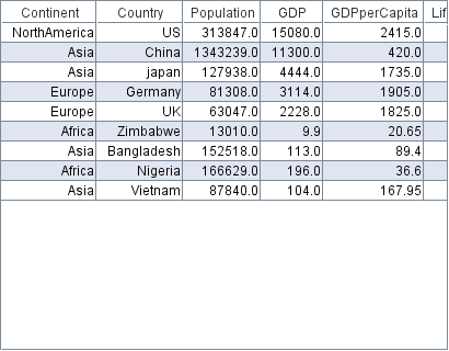
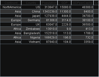
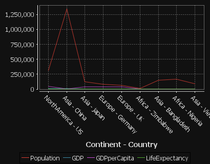
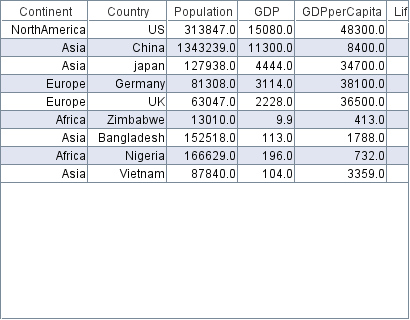
Country GDP's
The continent column is a top-level branch, the country column becomes leafs.The first two columns are GDP and GDP per Capita which become the size and color of the leafs respectively.

KDB Code
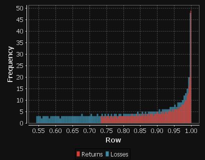
Histogram
Format
Each Numeric column represents a separate series in the histogram. The series values are placed into buckets and their frquency tallied.
Profit Distribution
Distribution of Returns and Losses
KDB Code
Line Chart
Format
- The first string columns are used as category labels.
- Whatever numeric columns appear after the strings represents a separate series in the chart.
Multiple Series with Time X-Axis
2 series are shown, one for Sales, One for Costs. x-axis is in months.
KDB Code
Single Category
One number column generates one series.
KDB Code
Multiple series
Each column is a new series/colored bar.
KDB Code
Multiple series with many categories on the X-axis
Each column is a new series/colored bar. When there are a lot of categories, some labels are hidden.
KDB Code
Pie Chart
Format
- Each numerical column represents a pie chart.
- The title of each pie chart will be the column title.
- Each row will be a section of the pie and will use the row title as a label.
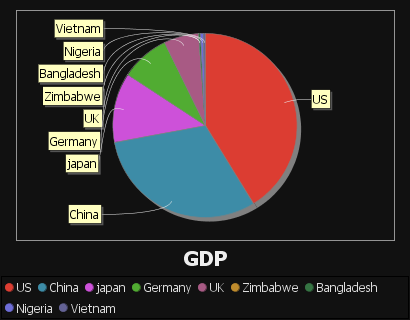
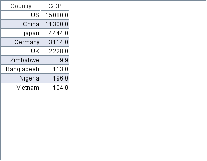
Single Pie Chart Example
A single numerical columns gives a single pie chart for that column.
KDB Code
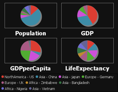
Multiple Pie Chart Example
Using multiple numerical columns gives a pie chart for each column.
KDB Code
Scatter Plot
Format
- Two or more numeric columns are required.
- The values in the first column are used for the X-axis.
- The values in following columns are used for the Y-axis.
- Each column is displayed with a separate color.
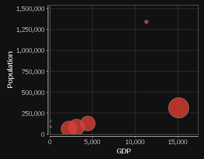
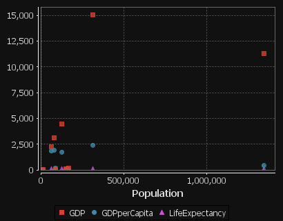
Country Population and GDP
The first column GDP is used for the x-axis. The subsequent columns are then plotted against that x axis as separate colored series.

KDB Code
Step Plot
Format
- The first date/time column found will be used for the x-axis.
- Each numerical column represents one time series line on the chart.
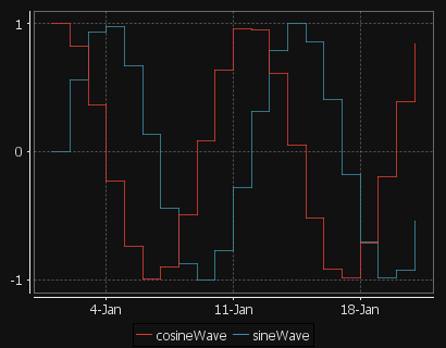
Day Sines
A sine/cosine wave over a period of days.
KDB Code
DOT Graph
Format
- The table can contain columns labelled from/to/label/style.
- If it does not, the first two columns are assumed to be from and to respectively.
- The dot file generated gives a directed graph from "from" nodes to "to" nodes with applicable style/labels.
- Graphviz Dot MUST be on your command line PATH for this to work.
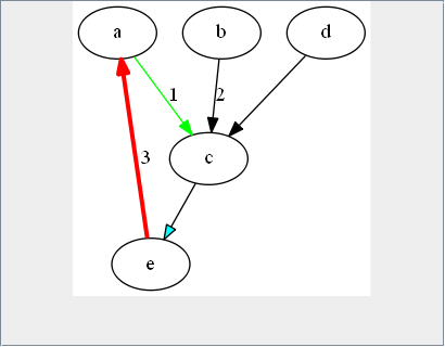
Alphabet Spaghetti
A directed graph with 5 nodes.

KDB Code