10+ Years ago, we released sqlDashboards. At the time we used what was the best and the most reliable charting library jfreecharts. It served us well for which we say a big thanks.
Now it’s time to launch a new HTML5 based SQL dashboards.
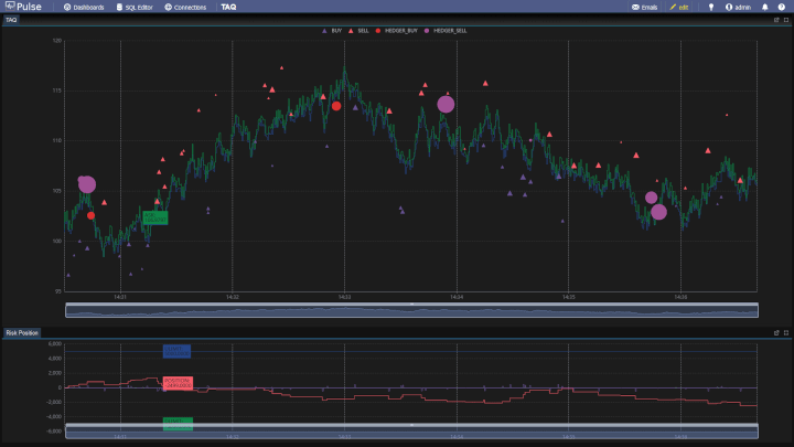
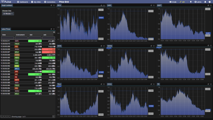
Pulse allows you to create and share real-time interactive dashboards with your team.
It currently includes almost all the charts you know and like from sqlDashboards plus a few extra. We will be reaching out to existing sqlDashboard customers to offer free trials as a thanks for your previous purchase.
We are excited to work on this new project for the next 10 years!
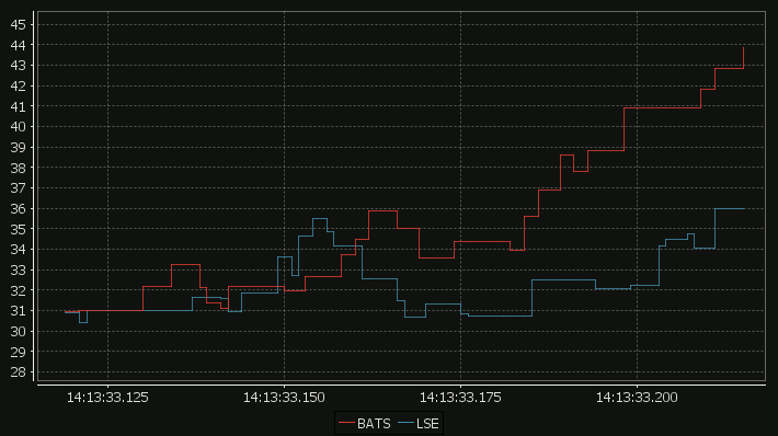
Our standard time-series graph interpolates between points. When the data you are displaying is price points, it’s not really valid to always interpolate. If the price was 0.40 at 2pm then 0.46 at 3pm, that does not mean it could be interpreted as 0.43 at 2.30pm. Amazingly till now, sqlDashboards had no sensible way to show taht data. Now we do:
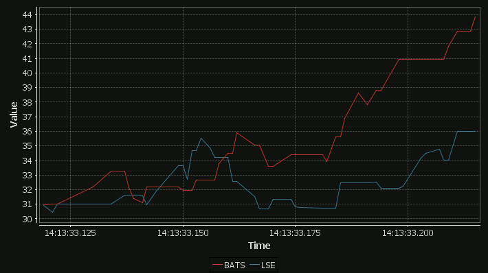
For comparison here is the same data as a time-series graph:
The step-plot is usable for time-series and numerical XY data series. The format is detailed on the usual chart format pages.
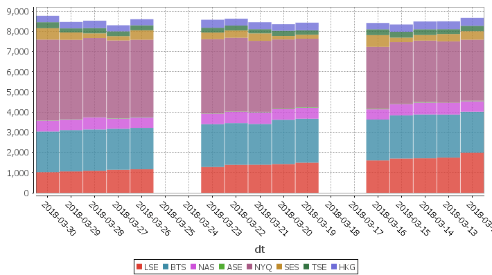
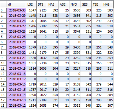
sqlDashboards has now added support for stacked bar charts. e.g.:
The chart format is: The first string columns are used as category labels. Whatever numeric columns appear after the strings represents a separate series in the chart. Row in the table is shown stacked above the other, in the order as they appear.
Tow small changes in the latest release:
– Hide editor when first opening. Upon adding a chart the editor will show again.
– Bugfix: Mac “Save As” dialog was hiding the filename prompt. Fixed.
As always, it’s available to download now.
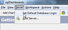
1.42 is now release and available to download. The biggest change is that saved files will no longer have usernames/pasaswords stored in them. This is to allow sharing amongst a team. Now sqlDashboards stores one default login as part of the software and attempts to use that with any opened files. If the login does not work it prompts the user. This can be changed under:
Full Change List:
Allow saving .das without username/password to allow sharing. Prompt user on file open if cant connect to server.
Bugfix: Allow resizing of windows within sqlDashboards even when “No table returned” or query contains error.
Allow setting File->title and use file name if file is Untitled.
If query is wrong and missing arg or something. Report why, report the reason.
KDB Database Only: Stop wrapping JDBC queries as we dont want kdb to use the standard SQL handler. We want to use the q) handler.
sqlDashboards 1.41 has been released and is available to download.
Changes include:
Support custom JDBC drivers and Authentication Services
Fix refresh rate display bug when widget is selected
Fix sqlchart.bat to allow running from any current path
The custom JDBC/security has been asked for a couple of times but it’s inclusion at this stage is experimental. We do have a few customers using it with qStudio and documentation is available here. If this interests you get in touch.
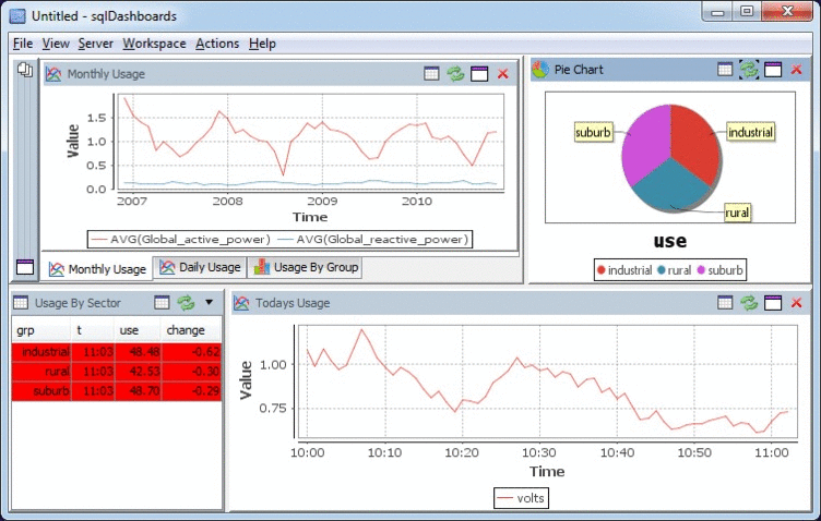
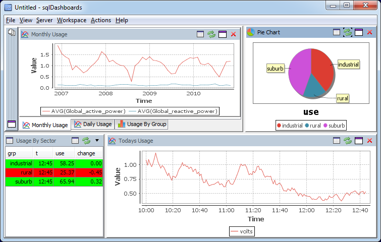
Let’s look at how we can display real-time and historical sensor data for Household Electrical usage using sqlDashboards.
The historical data is taken from the UCI Machine Learning Repository. This is a single CSV file with 1 minute readings between December 2006 and November 2010. i.e.
The Sensor Data Sql Dashboard
Time Series Data Format
The data came in the following format:
date
time
Global_active_power
Global_reactive_power
2006-12-16
17:24:00
4.216
0.418
2006-12-16
17:25:00
5.36
0.436
2006-12-16
17:26:00
5.374
0.498
Where the columns have the following meaning:
date: Date in format dd/mm/yyyy
time: time in format hh:mm:ss
global_active_power: household global minute-averaged active power (in kilowatt)
global_reactive_power: household global minute-averaged reactive power (in kilowatt)
voltage: minute-averaged voltage (in volt)
global_intensity: household global minute-averaged current intensity (in ampere)
sub_metering_1: energy sub-metering No. 1 (in watt-hour of active energy). It corresponds to the kitchen, containing mainly a dishwasher, an oven and a microwave (hot plates are not electric but gas powered).
sub_metering_2: energy sub-metering No. 2 (in watt-hour of active energy). It corresponds to the laundry room, containing a washing-machine, a tumble-drier, a refrigerator and a light.
sub_metering_3: energy sub-metering No. 3 (in watt-hour of active energy). It corresponds to an electric water-heater and an air-conditioner.
Creating the SQL Dashboard Charts
To create the live charts I:
Imported the data to MySQL database.
[raw]
[/raw]
Created a java process to insert live sensor data.
Added a time series monthly graph and using the sql query:
select STR_TO_DATE(DATE_FORMAT(Date, '%Y-%m-01'),'%Y-%m'),AVG(Global_active_power),AVG(Global_reactive_power) FROM power GROUP BY DATE_FORMAT(Date, '%Y-%m-01')
Added a daily time series rollup graph and using the sql query:
CREATE TABLE daily AS select Date,AVG(Global_active_power),AVG(Global_reactive_power) FROM power WHERE Date>'2009-11-11' GROUP BY Date;
Added a bar chart showing the different meter readings as bar charts per year:
select CAST(YEAR(Date) AS CHAR(4)) AS Year,AVG(Sub_metering_1),AVG(Sub_metering_2),AVG(Sub_metering_3) from power GROUP BY YEAR(Date)
Added further queries to show the live data for today…
This gave me the final dashboard:
[raw]
[/raw]
You are currently browsing the sqlDashboards Blog weblog archives for the sqldashboards category.