April 1st, 2018 by ryan
sqlDashboards is specialised for real-time data visualization. Often this includes monitoring the state of orders, whether that’s baskets of goods being ordered online or financial transactions, we want to help you see what state those items are in. To support visualizing this data we’ve integrated the most powerful open source graphing: DOT and graphviz. If you install graphviz and make it available in your path, you can automatically get sqlDashboards to generate graphs from tabular data, like so:
| From |
To |
label |
cnt |
| PendingCancel |
Calculated |
Rejected |
50 |
| PendingReplace |
Calculated |
Rejected |
10 |
| PendingReplace |
Calculated |
Replaced |
40 |
| Calculated |
PendingReplace |
PendingReplace |
50 |
| Calculated |
Filled |
Trade |
9400 |
| Calculated |
Calculated |
Trade |
5239 |
| PendingCancel |
Removed |
Cancelled |
150 |
| Calculated |
PendingCancel |
PendingCancel |
200 |
| New |
Calculated |
Calculated |
9660 |
| New |
Removed |
Rejected |
140 |
| Created |
Removed |
Rejected |
300 |
| Created |
New |
New |
9800 |
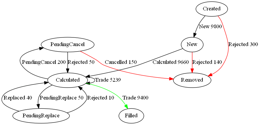
Notice to get the labels and styling you use a column called label or style respectively. The full format is detailed on the sqlDashboards example page.
November 20th, 2016 by ryan
This is a quick video tutorial showing how to add highlighted rows to a dashboard as a few people had emailed asking this:
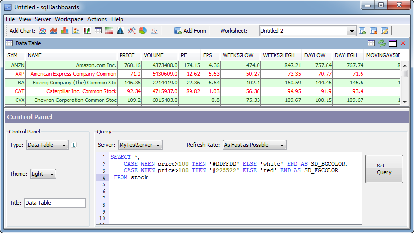
To highlight a row we use specially named sqlDashboards columns SD_ that affect how the result is displayed but are not shown in the table
- Add a column called SD_BGCOLOR specifying a color to use for the background of that row e.g. ‘green’ or using HTML hex triplet notation e.g. #224466
- Add a column called SD_FGCOLOR specifying the color to use for the foreground of that row
Hex triplet is a six-digit, three-byte hexadecimal number used in HTML, CSS, SVG, and other computing applications to represent colors. The bytes represent the red, green and blue components of the color. One byte represents a number in the range 00 to FF (in hexadecimal notation), or 0 to 255 in decimal notation. This represents the least (0) to the most (255) intensity of each of the color components.
Using Case When
Commonly you will probably want to use SQL’s CASE-WHEN to alternate colors depending on an existing column value. e.g.
[raw]
[/raw]
December 11th, 2015 by ryan
The following steps explain how to send an email with chart image attachments from the command line. First we must install the necessary email tools in linux:
Install Email Sending on Linux
apt-get install mutt

vi ~/.muttrc
That last line, opens the configuration for editing. For gmail you will have details like this:
account-hook imap://gmail/ “set
set imap_user = 'user@domain.com'
set imap_pass = 'PASSWORD'
set smtp_url = 'smtp://user@domain.com@smtp.gmail.com:587/'
set smtp_pass = 'PASSWORD'
set from = 'user@domain.com'
set realname = 'John'
set folder = 'imaps://imap.gmail.com:993'
set mbox= '+Inbox'
set spoolfile= '+Inbox'
set postponed= '+[Gmail]/Drafts'
set trash = '+[Google Mail]/Trash'
set header_cache=~/.mutt/cache/headers
set message_cachedir=~/.mutt/cache/bodies
set certificate_file=~/.mutt/certificates
set move = no
set timeout=15
auto_view text/html
To test this, first run “mutt”, it should display your gmail inbox. Then send an email using the command:
mutt -s "test" receiver@domain.com <<< "test message"
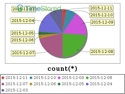
Install sqlChart and generate pie charts
- Download sqlDashboards.jar
- Copy it to your /usr/local/bin directory
- Create an alias so we can run it with a shorter name
- Run command to generate chart
wget http://www.sqldashboards.com/files/sqldashboards.jar

mv sqldashboards.jar /usr/local/bin/

alias sqlchart="java -cp /usr/local/bin/sqldashboards.jar  com.timestored.sqldash.SqlChart"
sqlchart --servertype mysql --chart piechart --user USERNAME --password PASSWORD --database DATABASENAME--out pie.png --execute "select DATE(time),count(*) from qstudioreg group by DATE(time) ORDER BY DATE(time) DESC limit 9"
Voila we have our chart:
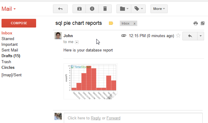
Send email with attachments
Use mutt to send the email, with -a to specify attachments like so:
mutt -s "sql pie chart reports" ryan@timestored.com -a pie.png <<< "Here is your database report"
Done. So we successfully configured mutt for sending email, then generated our pie chart from mysql using sqlchart then we emailed it as an attachment. If you have any problems please let me know and I'll try to help. Here's the email in my inbox:
April 18th, 2014 by ryan
I came across this interesting post on ASCII pie charts for MySQL. I thought I’d use our command line tool sqlChart todraw the database pie chart instead.
[raw]
[/raw]
Simply changing our mysql command to sqlchart and adding the additional arguments
"-o c:\temp\aa\sizes.png -c piechart"
gives us the following SQL Pie Chart:
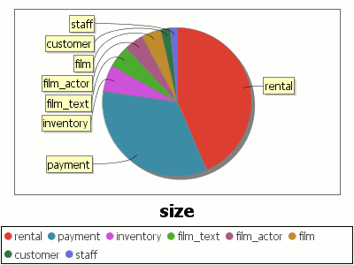
MySQL Sakila Table Sizes Pie Chart
Notice because sqlchart’s command line arguments closely resemble the mysql command line options, we can quickly change the calls from querying to graphing.